
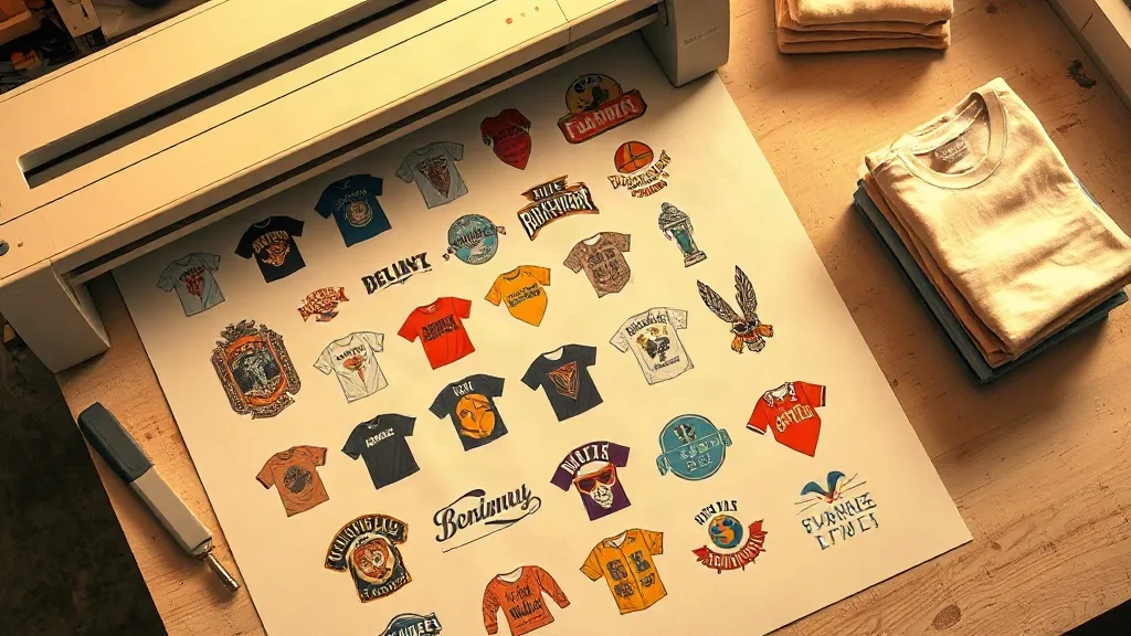
You can pick the right film, dial in your powder, and buy a press that holds temperature within two degrees, and still end up fighting a transfer that wrinkles, shifts, or leaves a hard edge on the shirt. More often than not the culprit is not the equipment at all. It is the layout. How you arrange artwork on a DTF Gangsheet decides how cleanly the sheet cuts, how easily each piece peels, and how much film you throw in the bin at the end of the day. Nesting is the quiet skill behind every smooth production run, and it rarely gets the attention it deserves.
This guide walks through the layout decisions that matter most: spacing, orientation, grouping, and the small habits that keep a busy shop from reprinting jobs it already finished. If you print apparel in any volume, these choices compound fast, for better or worse.
Why nesting deserves its own step in your workflow
Most shops treat the gangsheet as a container. You drop designs in, hit send, and hope the RIP handles the rest. That works until you notice the pattern: certain sheets always seem to produce transfers with ragged edges, and certain jobs always seem to need a second print. Those are not random failures. They are layout problems showing up as production problems.
Nesting affects three things at once. First, it controls how much film and powder each job consumes. Second, it determines whether the cutter can separate pieces cleanly. Third, it shapes how the transfer behaves when you actually press it, because a piece crowded against a neighbor can pick up heat and pressure unevenly. Treating layout as a deliberate step, rather than an afterthought, is the cheapest quality upgrade available to any DTF operation.
Spacing: the number that prevents most headaches
Every DTF shop eventually learns that designs placed too close together cause trouble, but the reason is worth understanding. The cutter needs a clear path around each design. When two pieces sit nearly touching, the blade has no room to travel, and you get incomplete cuts, torn edges, or pieces that stay fused to the sheet.
A working rule for gaps
A practical starting point is a gap of roughly 6 to 10 millimeters between designs, with slightly more around pieces that have fine detail or thin strokes. Very small designs, like a left-chest logo or a sleeve tag, often need a bit more breathing room than their size suggests, because the blade has less margin for error on a short cut path.
It helps to think about the gap as belonging to the cutter, not to the design. You are not padding artwork for aesthetic reasons. You are reserving space for a mechanical process that needs a route in and out of every shape.
Where people go wrong
- Squeezing one more design into a sheet and breaking the spacing rule for everything around it
- Using a single gap size regardless of how intricate the artwork is
- Forgetting that the outer edge of the sheet also needs clearance from the cut path
That last point catches a lot of people. Designs placed flush against the sheet border can fail to cut cleanly because the blade runs out of room at the edge. Leave a border margin, and those failures disappear.
Orientation and grouping: the overlooked efficiency lever
Once spacing is under control, the next question is how to arrange designs across the sheet. There are two broad approaches, and the right one depends on how you work.
Group by job versus group by size
Grouping by job means keeping all the pieces for a single order together. This makes packing and fulfillment simpler because everything for one customer sits in one zone of the sheet. Grouping by size means clustering similar dimensions together, which tends to produce a tidier layout with less wasted film.
Neither approach is universally better. A shop doing a lot of small, varied orders usually benefits from job grouping because it reduces sorting time later. A shop running the same handful of designs repeatedly often gets more from size grouping, since the layout becomes predictable and can be templated.
Rotation is a tool, not a default
Rotating a design 90 degrees can fill awkward gaps and rescue film that would otherwise go to waste. But rotation is not free. Some artwork, particularly anything with directional texture or a clear top and bottom, reads wrong when turned, and a rotated piece is easy to press the wrong way if your team is moving fast. Rotate when it genuinely saves space, and mark the sheet so nobody has to guess which way is up.
Film waste starts before the sheet is sent
Most film waste is not created by the printer. It is created by the layout you approved. A sheet with generous margins, scattered small designs, and no attempt at grouping can easily run at half the effective yield of a well-planned one.
There is a simple habit that helps here: before sending any job, look at the sheet as a whole and ask where the empty space is. If there are large gaps that no design fills, ask whether a small add-on, like a spare logo or a sample piece, could use that space. Shops that keep a running list of small designs to fill leftover gaps get noticeably more output from the same roll of film.
Keep a filler library
Filler designs are small, frequently requested pieces that you can drop into spare space without disrupting the main job. Common examples include chest logos, sleeve marks, and standard size tags. Because they are small and you already know how they cut, they slot into gaps with minimal risk. Over a month, that reclaimed space adds up to a meaningful amount of free production.
Matching layout to garment and placement
A gangsheet is not abstract. Every piece on it is headed for a specific spot on a specific garment, and that context should influence how you lay things out. Full-front prints, left-chest logos, and sleeve designs have different size ranges, different detail tolerances, and different press requirements.
Grouping by placement, rather than purely by customer or size, can simplify the pressing stage considerably. If all your left-chest pieces sit together on the sheet, whoever runs the press can work through them in one rhythm instead of switching setups repeatedly. That kind of sequencing saves real minutes on a busy day, and it reduces the chance of a piece being pressed in the wrong position.
A note on mixed-detail sheets
Mixing very fine detail with bold, simple shapes on the same sheet is workable, but it deserves extra spacing around the detailed pieces. Fine lines are the first thing to fail when a cut path is compromised, and they are also the first thing to show defects after pressing. Give them room and keep them away from the sheet edge.
Building a repeatable nesting routine
The shops that nest well do not do anything exotic. They just apply the same handful of checks every time, which turns layout from a source of surprises into a predictable step.
- Confirm the design dimensions against the actual garment placement before placing anything.
- Apply the standard gap, then widen it around fine-detail artwork and small pieces.
- Leave a clear border margin around the sheet edge.
- Group by whatever reduces your downstream sorting and pressing time.
- Scan for empty space and fill it with known filler designs if it makes sense.
- Double-check orientation on any rotated piece and label it clearly.
Run that checklist for a couple of weeks and it becomes automatic. The payoff shows up as fewer reprints, cleaner cuts, and less film leaving the shop as waste.
Frequently asked questions
How much space should I leave between designs on a DTF Gangsheet?
Start with 6 to 10 millimeters between designs and increase that for intricate artwork, thin strokes, and very small pieces. Also keep a margin at the outer edge of the sheet, since the cutter needs room to travel around every shape, including the ones near the border.
Is it better to group a gangsheet by customer or by design size?
It depends on your order mix. Grouping by customer makes packing and fulfillment easier when you handle many small, varied orders. Grouping by size produces tidier layouts and less waste when you run a limited set of designs repeatedly. Many shops use a hybrid, grouping by job but arranging each group efficiently within its zone.
Can I rotate designs to save film?
Yes, and it is often worthwhile, but only when the artwork does not have a clear top and bottom that would read wrong when turned. Always mark rotated pieces so the pressing team knows the correct orientation, since a rotated design is easy to press the wrong way during a fast run.
What are filler designs and why should I keep them on hand?
Filler designs are small, frequently requested pieces such as chest logos, sleeve marks, or size tags that you can drop into leftover space on a sheet. Because you already know how they cut, they fill gaps with little risk, and the reclaimed film adds up to real extra output over a month.
Does layout really affect press quality?
It does. Pieces crowded against neighbors can pick up heat and pressure unevenly, and designs placed too close to the sheet edge often cut poorly, which shows up as ragged edges after pressing. Good spacing and grouping give you transfers that press cleanly and consistently.